1. Nola
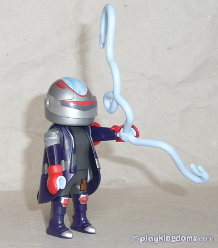
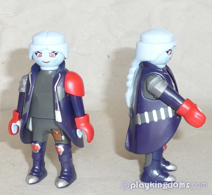
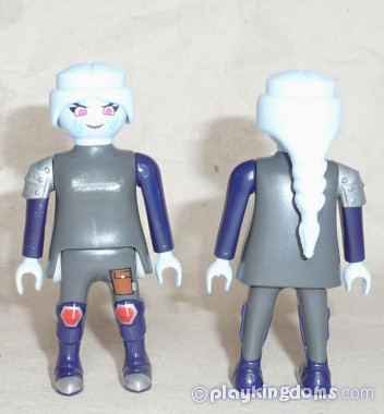
And she also has a gorgeous blue head. I really like the face
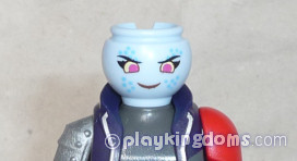
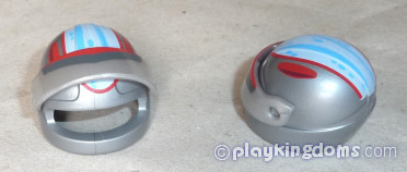
I think the motorcycle helmet is a poor option, imo. As are the (gorgeous) blueish vines to pass for the appendages.
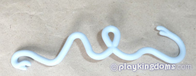
The vines all came twisted like this:
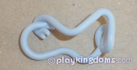
Figure vs. Sticker As mentioned I think the motorcycle helmet is not a good option to portray her - I believe a medieval one, with a visor would have worked better. The jacket is also lacking, but I am not sure what would be better... it is not easy to accurately playmorepresent her, I think.
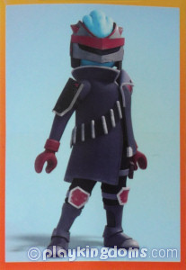
2. Inuit
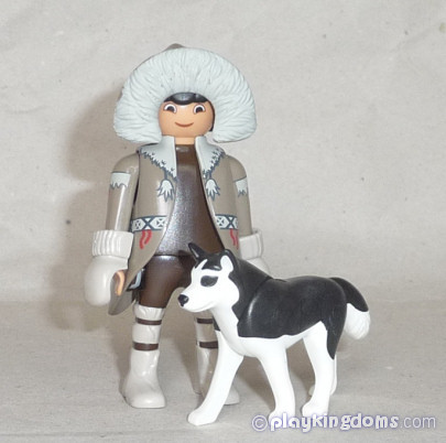
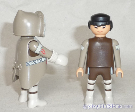
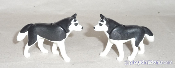
The doggy is the same as the more recent polar sled.
The face has a surprised look about it, but it's nice, imo.
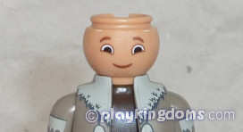
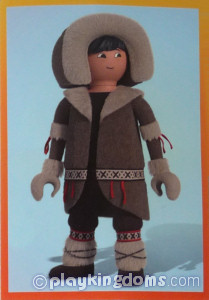
Figure vs. Sticker The figure is a quite accurate representation of the character. Hair excepted
3. Ook Ook
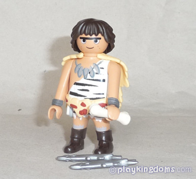
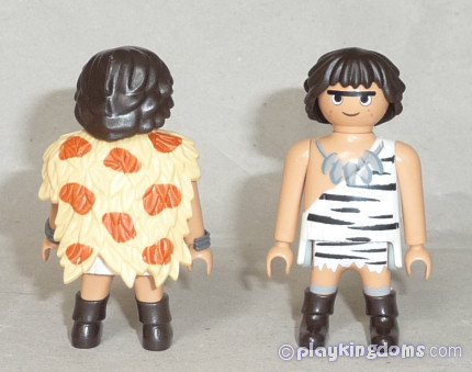
The face is very interesting too, with a monobrow that is quite a novelty
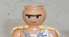
The leafy cape and belt, though existing molds, are new in these colors, and the printing is very nice
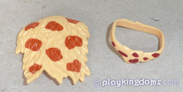
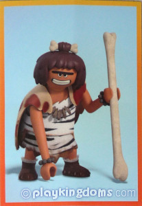
Figure vs. Sticker Though the klicky himself is very accurate, the hair is really not - that'd require a new mold. Also, the bone he brings is a bit big to use in the hair (if there was a new hair mold), and far too small to match the bone staff he is holding in the sticker...
4. Black Knight
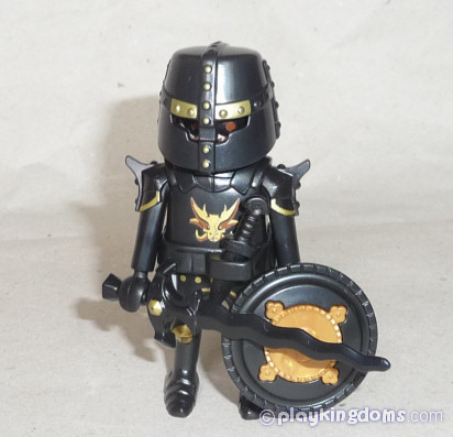
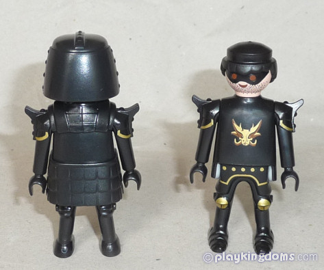
The face does nothing for me - not new, and I don't particularly like it... another strange choice.
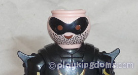
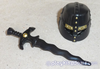
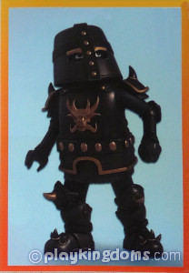
Figure vs. Sticker I suppose without a new sculpt for the legs (with the spikes/claws), the klicky is a fine representation of the character. No idea about the face or the hair sculpt.
Next: 70139 Series 2 (2)
Queen Tahra, December 2022
